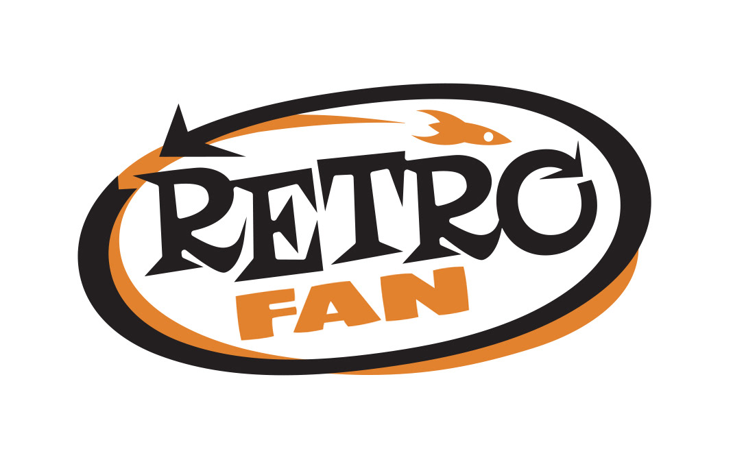
Above is the final version of the RetroFan magazine logo. It took a dozen or more minor re-workings to get to get to the final. That doesn't include all of the earlier attempts at a viable design. I used existing typefaces for all of the designs. This version uses Risque (which I modified) and CCFramistat.

One of many variation of the "final" logo.
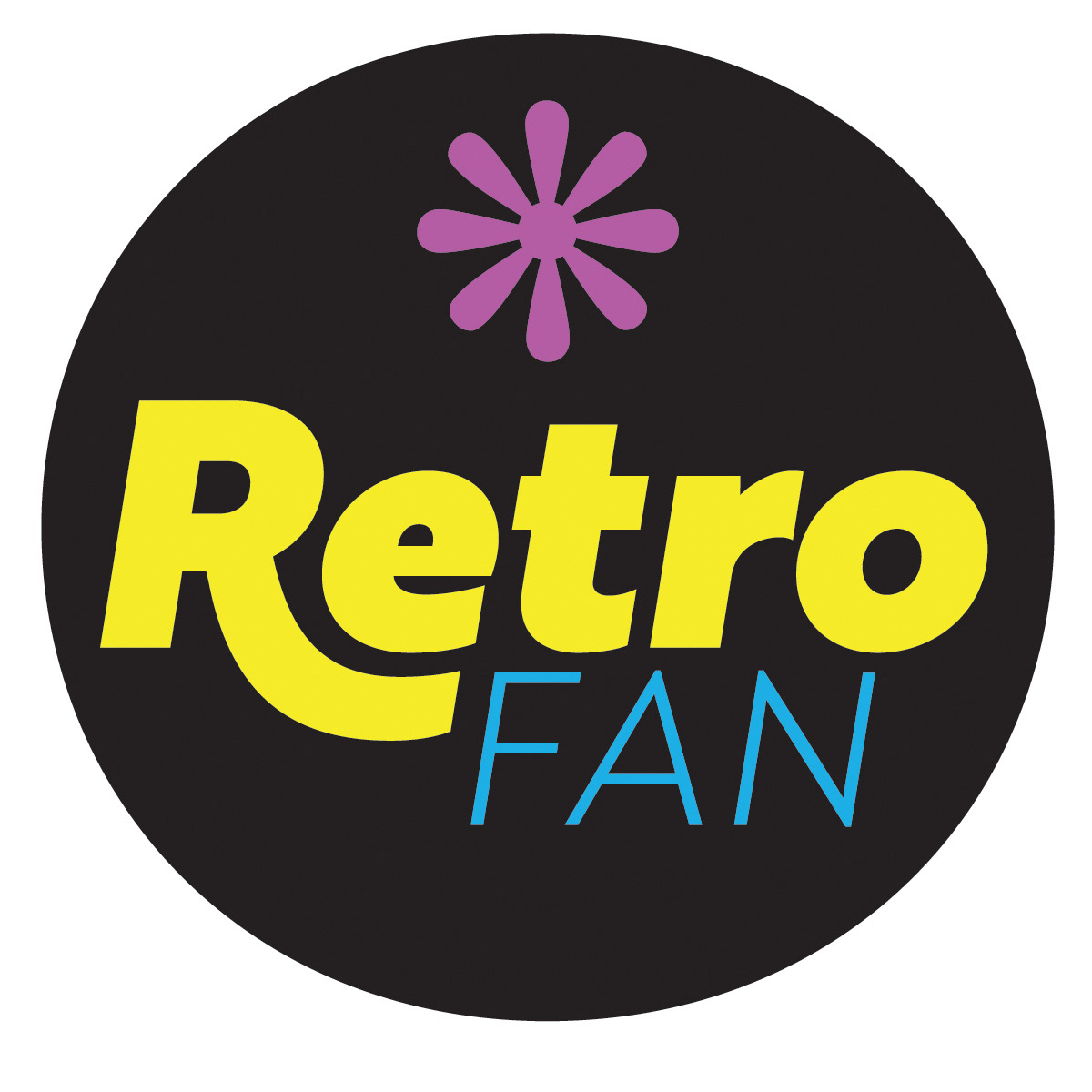
This is my first attempt. I thought it would be cool to have a round logo for the cover. I was out-voted.
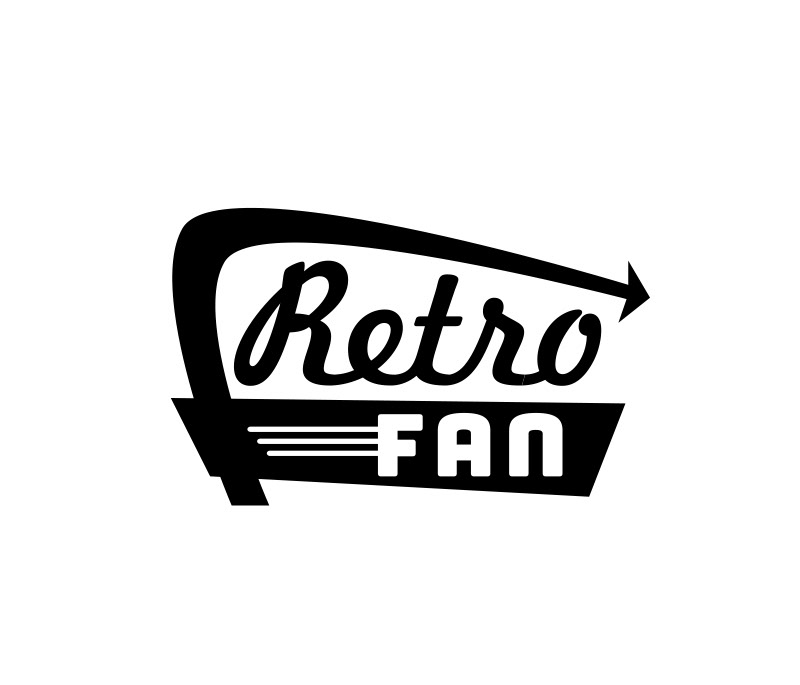
An early rejected design. A little too "motel-specific." I do like the spare-ness of it, though.
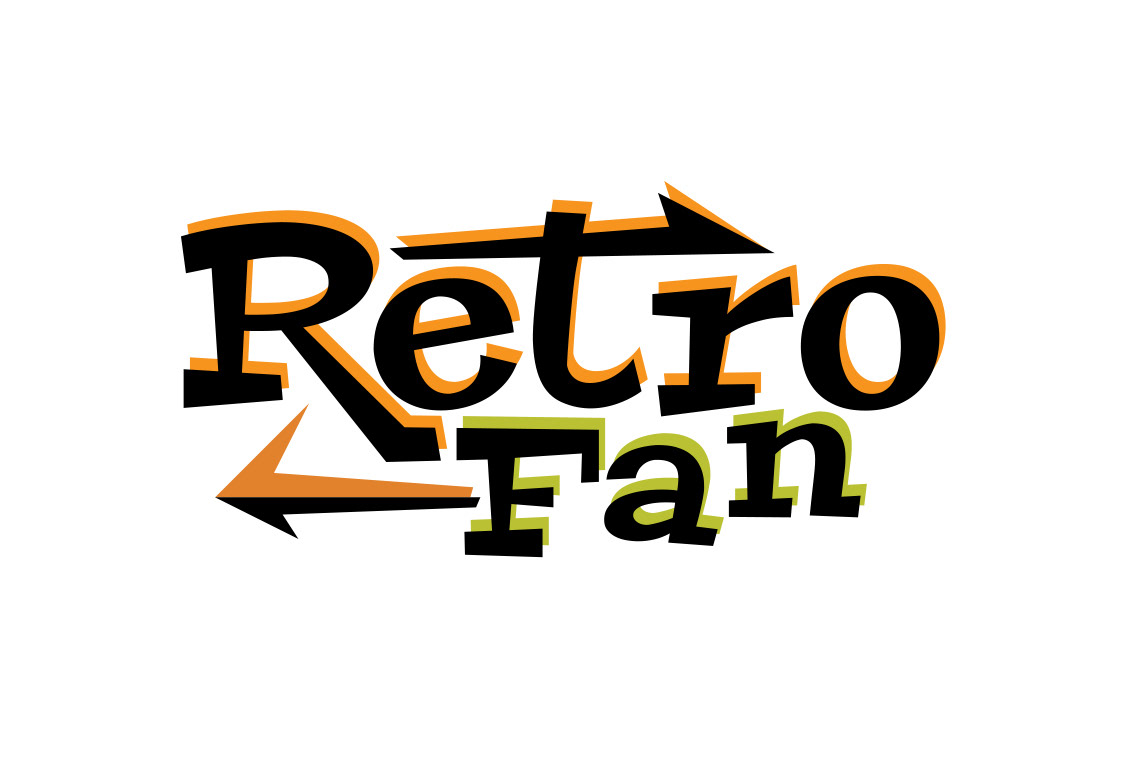
Another early attempt. It's my favorite of the rejected designs. The font used is Peralta (it's very fun, I like it a lot) and was altered a bit by me.